


Having a great website is crucial to the success of your ISP business since this is the first point of contact with your potential customers, and it’s where they go to learn more about your services, pricing, and support options. However, creating a website that will boost your business growth is not easy, so designing a winning website for your ISP will take careful planning and consideration.
It’s important to note that the impact of a well-designed website will vary depending on the market in which you operate. In some countries, potential customers tend to contact their local ISPs from various offline sources instead of visiting their website. Therefore, it’s essential to consider the local market behavior when designing the website. Furthermore, the impact of a website on an ISP’s business growth will also depend on the marketing approach of the business owner. For example, if the marketing strategy is focused on building a strong online presence, the website will be crucial in attracting and converting potential customers. On the other hand, if the marketing strategy is more traditional and relies on word-of-mouth or offline advertising, then the website’s impact may be less significant.
In this article, we’ll explore what you need to know to design a winning website for your ISP and provide some examples for your inspiration.
But what makes a website “winning?” A winning website is one that not only looks great but is also user-friendly, informative, and easy to navigate. It provides customers with everything they need to know about your services, pricing, and support options. It converts visitors into customers.
Before you start designing your website, it’s important to understand your audience. Who are your target customers? Are they residential, business, or rural customers? What are their needs and preferences? What information are they looking for when visiting your website?
For example, if your target audience is residential customers, they might be interested in learning about your pricing plans, internet speed options, and support options. If your target audience is business customers, they might be interested in learning about your dedicated internet access options, cloud services, and cybersecurity options. Understanding your audience will help you tailor your website to their needs.
Once you understand your audience, it’s time to choose the right design for your website. A user-friendly design is crucial for any website, but it’s especially important for an ISP website. It should be easy to navigate and should provide customers with a seamless experience.
Adaptive design ensures that your website looks great on any device, including desktops, laptops, tablets, and smartphones. This means that the website will adjust its layout based on the size of the screen. However, you can prioritize a mobile-first design since most customers will be accessing your website from their smartphones. 57% of internet users say they won’t recommend a business with a poorly designed website on mobile.
When choosing a design, it’s also important to consider your branding. 75% of consumers admit to making judgements on a company’s credibility based on the company’s website design. Thus, your website should reflect your brand and should be consistent with your other marketing materials. Here are some examples of great website designs:
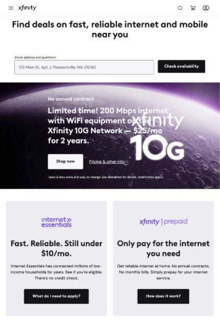
Comcast Xfinity is one of the leading ISPs in the United States, and its website is a great example of an effective and user-friendly design. The website’s homepage is clean and simple, with a clear call to action button that encourages visitors to sign up for their services.
High-quality and relevant content is essential for any website, but it’s especially important for an ISP website. Provide customers with all the information they need to make an informed decision about your services.
Here are a few tips for creating effective landig page for your ISP business:
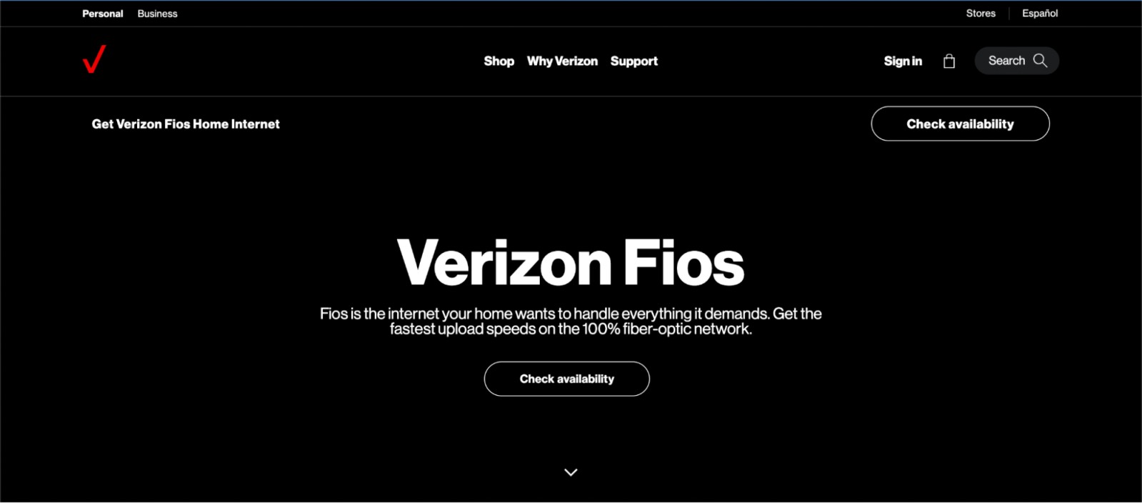
Verizon Fios is a well-known ISP, and their website is designed to appeal to both residential and business customers. The homepage features a prominent CTA button, as well as easy-to-use navigation that directs visitors to different sections of the site.
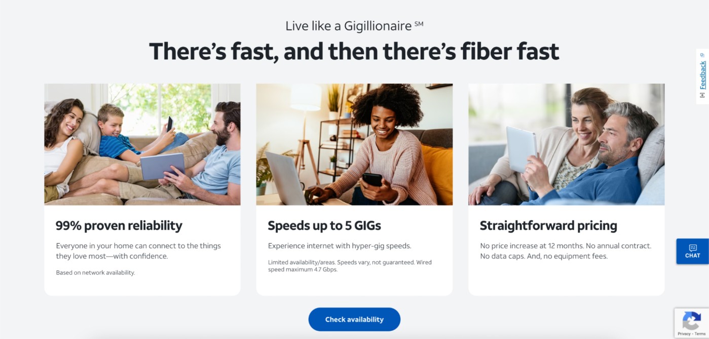
AT&T is a well-known ISP, and their website is designed to highlight their various internet packages and services. The site’s homepage features a clean, modern design, with a clear CTA button and easy-to-read text that outlines the benefits of their services. They show the internet speed that they provide as well as appealing message to gamers, who need high-speed internet.

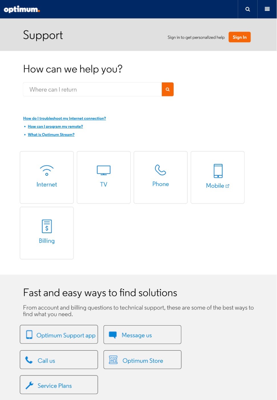
The Optimum website features a simple, easy-to-use design that clearly focuses on services and pricing. The homepage includes a prominent CTA for customers to sign up, and the site is optimized for easy browsing on all devices. Moreover, they show various ways in which their clients can get in touch with them in case of an issue.
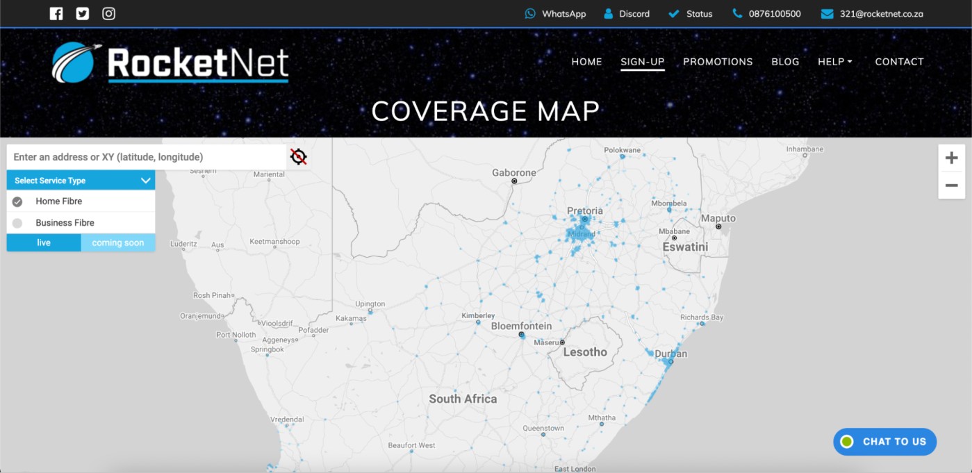
For example, our client RocketNet, an ISP from South Africa, utilizes 28East to show potential customers the availability of coverage in specific locations, and ultimately convert those customers into clients.
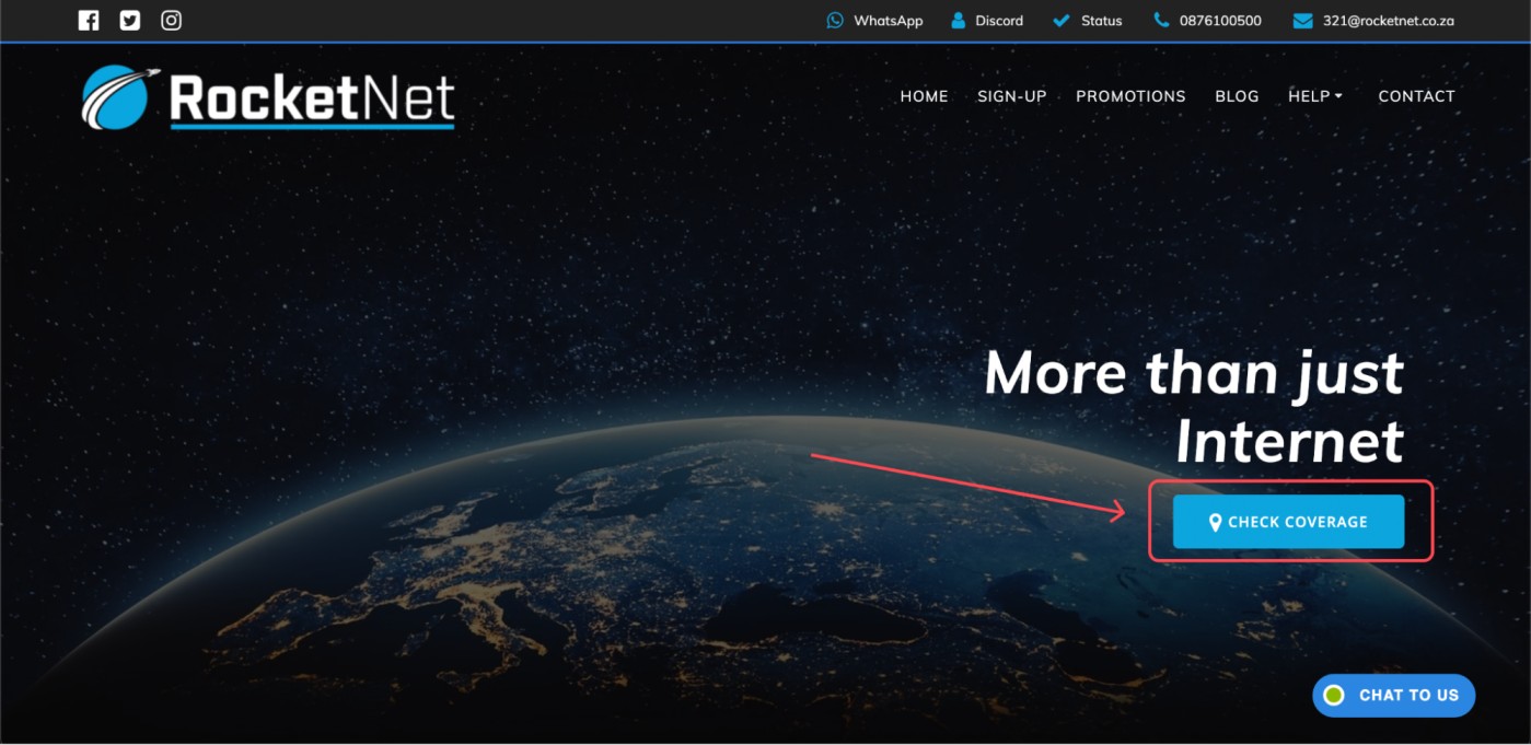
We recommend making it as easy as possible for people to find it in one click as RocketNet did with their website. By clicking on “Check coverage” website visitors are redirected to the next page, where they can see the coverage map.
3.5. Promotions: In today’s competitive digital landscape, it’s not enough to just provide reliable internet service – you also need to capture the attention of potential customers and incentivize them to choose your business over others. Displaying promotions and discounts prominently on your website can do just that by grabbing visitors’ attention and encouraging them to take action and sign up for your services. With effective promotion strategies, you can increase conversions, build customer loyalty, and, ultimately, grow your business.
4. Show your contact details: Make it easy for visitors to contact you by prominently displaying links to your social media accounts on every website page. Use a contact form that’s easily accessible with just one click and include a CAPTCHA test to prevent spam
5. Take advantage of the Blog section: Many ISPs overlook the benefits of publishing blog articles on their websites. However, the right content on your blog can serve your business in several ways:
5.1. Creating educational content helps your potential customers understand the benefits of your services and builds your authority in the industry. Additionally, through blog articles ISPs can help their customers to better understand how to use their internet service, resulting in improved customer satisfaction and reduced support costs. Here’s an article about the benefits of customer education for ISPs: How to know when your business is doing it right.
5.2. Publishing content from your blog on social media will help you reach a wider audience, leading to higher brand awareness. Moreover, it helps to create a sense of community around your brand, which is essential for the success of local ISP businesses.
5.3. We cannot stress enough the importance of publishing blog articles on your website for SEO and ranking purposes. Regularly posting relevant and valuable content on your blog can improve your website’s search engine visibility and increase organic traffic. Google and other search engines prioritize websites with fresh, unique, and quality content, and publishing useful blog articles is an excellent way to meet these criteria.
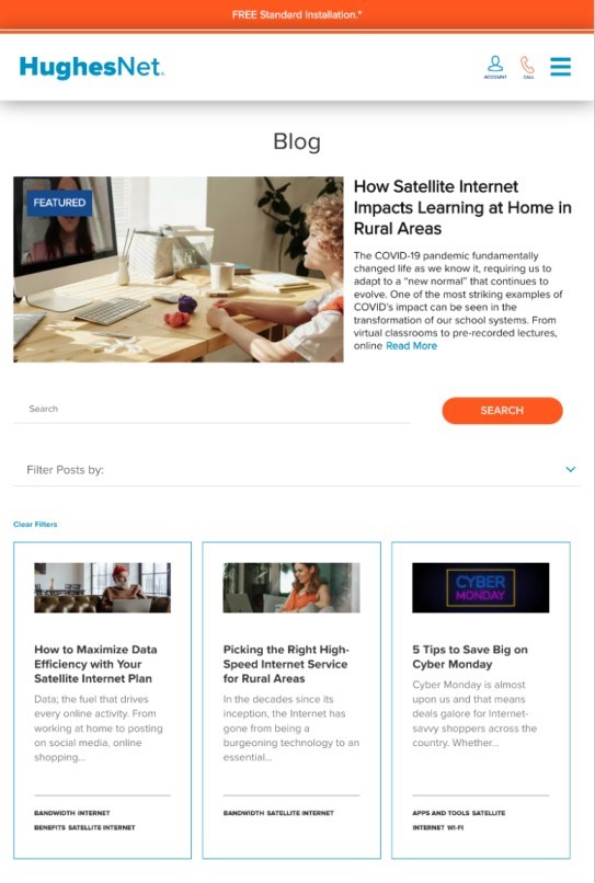
The HughesNet blog section covers internet services, technology, and lifestyle topics. It also provides tips and tricks for optimizing internet speeds and improving customers’ online experiences.
6. Customer portal: Having a customer portal on your ISP business website is crucial for building customer loyalty and satisfaction. By providing a centralized platform for customers to manage their accounts, view billing statements, and access support resources, you demonstrate a commitment to transparency and convenience that can help differentiate your business from competitors. Not only does this make it easier for customers to interact with your business, but it also frees up your support team to focus on more complex issues. Additionally, the data gathered from customer portal interactions can be used to inform marketing strategies and improve overall customer experience.
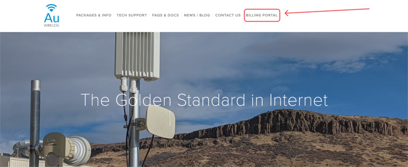
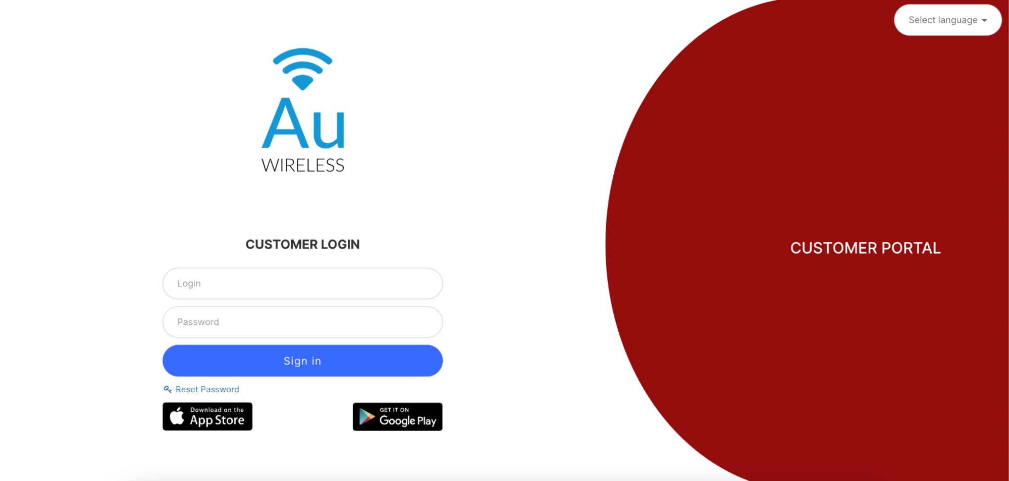
For example, our client Au Wireless, an American ISP, have a link to the Splynx customer portal on their homepage, which simplifies it for their customers to access their billing, support and service management.
7. Show your online reviews: Over 92% of consumers check online reviews before buying a service from you. Thus, it is crucial to show the feedback from your subscribers about the quality of services that your ISP provides. For example, our client from New Zealand, Wireless Nation, created a dedicated section “What Our Customers Think” on their homepage, which serves as a proof of their credibility and ultimately leads to higher conversions.
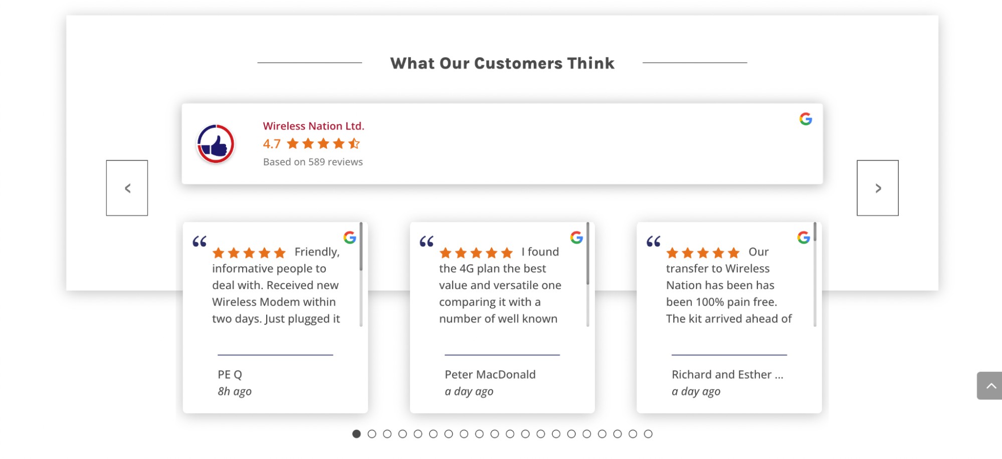
You must encourage your customers to leave Google reviews to gain credibility for your brand. Here is an article about the proven way how ISPs can generate more positive reviews.
Having a website is important, but it’s not enough if your website isn’t easily found by potential customers. That’s where search engine optimization (SEO) comes in. SEO is the process of optimizing your website to rank higher in search engine results pages (SERPs).
Here are a few tips for optimizing your website for search engines:
Keyword research: Identify the keywords that potential customers are using to search for ISPs in your area, and incorporate them into your website content.
On-page optimization: Optimize your website pages, including the title tags, meta descriptions, and headers.
Local search optimization: If you serve a specific geographic area, make sure to optimize your website for local search. This includes adding your business information to local directories and creating location-specific content.
The speed and load time of your website can have a significant impact on your overall traffic. Your ultimate goal is to keep visitors engaged and interested in your content for as long as possible. However, if your website takes too long to load, it can lead to high bounce rates and a decrease in user engagement. 39% of people will stop engaging with a website if images won’t load or take too long to load. To address this issue, there are various steps you can take to improve the speed of your website. For example, caching, compressing content, and optimizing images are effective ways to make a noticeable difference in your load times.
It’s important to remember that the longer your website takes to load, the higher the risk of losing potential customers. With so many options available to users, it’s essential to provide a seamless experience that meets their expectations. By prioritizing speed and load times, you can create a website that engages users, increases traffic, and ultimately drives business success.
By following the tips and guidelines outlined in this article, you can design a website that not only looks great but also provides customers with everything they need to know about your services, pricing, and support options. A winning website can help you stand out from the competition and attract more customers to your business.
Find out how Splynx helps ISPs grow
Learn more