


The most recent version of our website was published back in 2017.
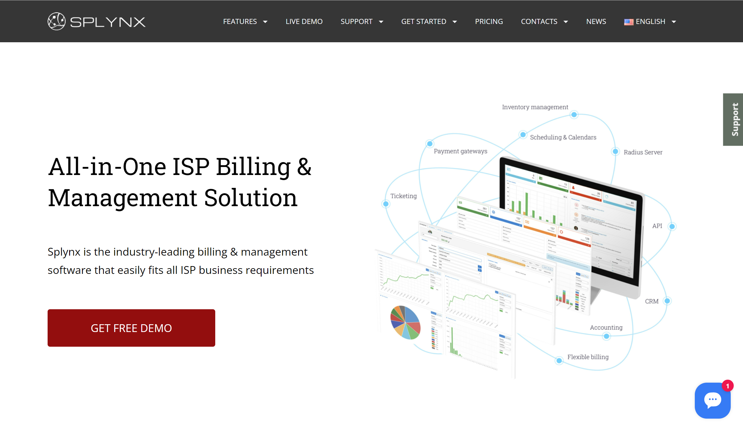 Since that time, the company has evolved a lot. So as of 2022, we want a new website that reflects more on what we are today. This resulted in a complete revamp of the old website, and in this blog post, we dwell on the reasons and the outcomes.
So what was so bad about the old website that made us decide to wipe it out entirely and start from scratch? Let’s deconstruct it.
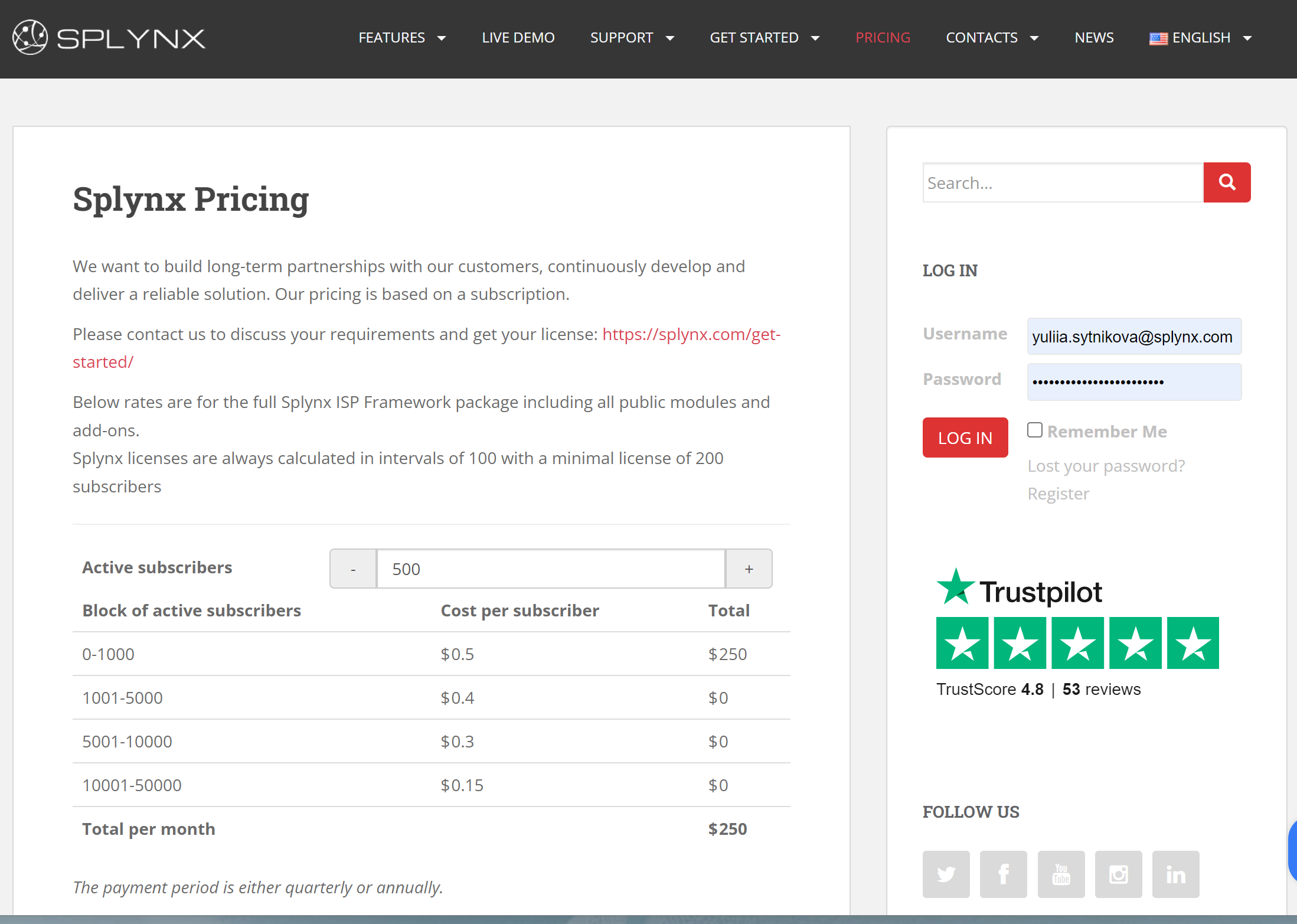
This was the first bump down the road. In our industry, it’s important to showcase a product’s value and educate customers about the product from the start.
It was a major problem because you could easily get lost trying to navigate the website. As you might expect, our website was failing to gain much traction.
We’ve expanded our toolset a way beyond than original ISP billing and network management software. The original landing page layout wasn’t handling it well to deliver it to the customers.
Being a B2B software company, case studies serve as a business card for us, but we had few of them presented on the old website though there were plenty of success stories we’re proud of.
It’s a well-known fact that the website needs a major facelift every three years because the product evolves, and the audience’s needs also change. Ours was waiting for it for quite some time.
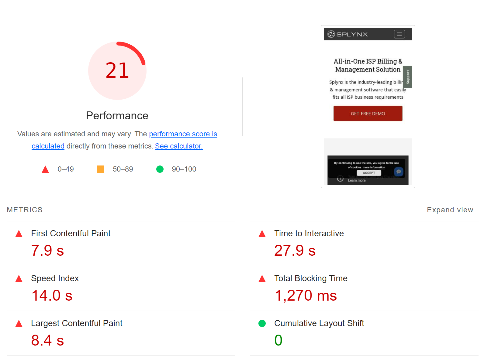
Another thing that held up the process was actually the “friendliness” of the website. It contained hefty resources that caused the website pages’ slow loading performance.
And along with these major problems, we also wanted to shape the market perception and rethink the main message that was conveyed. Previously, we made a stab at presenting Splynx as an easy solution, but we hadn’t had an adequate toolset for it.
So now we aim to be the tool anyone can use, not just a small number of techies. And show that Splynx is not actually as scary as it might seem from the first blush 😄
First off, we wanted to have a website that works not simply as a “business card”, but as a comprehensive manual guide that will immediately showcase the features and perks to the new people. This was devised to ensure the website and the product complementarity.
Here are the biggest achievements of the website overhaul:
If users who aren’t familiar with our product yet jump on the homepage, they’ll quickly find what they need — features, solutions to their problems, lots of product screenshots, and testimonials that act as social proof. You can learn about the product even before the live demo.
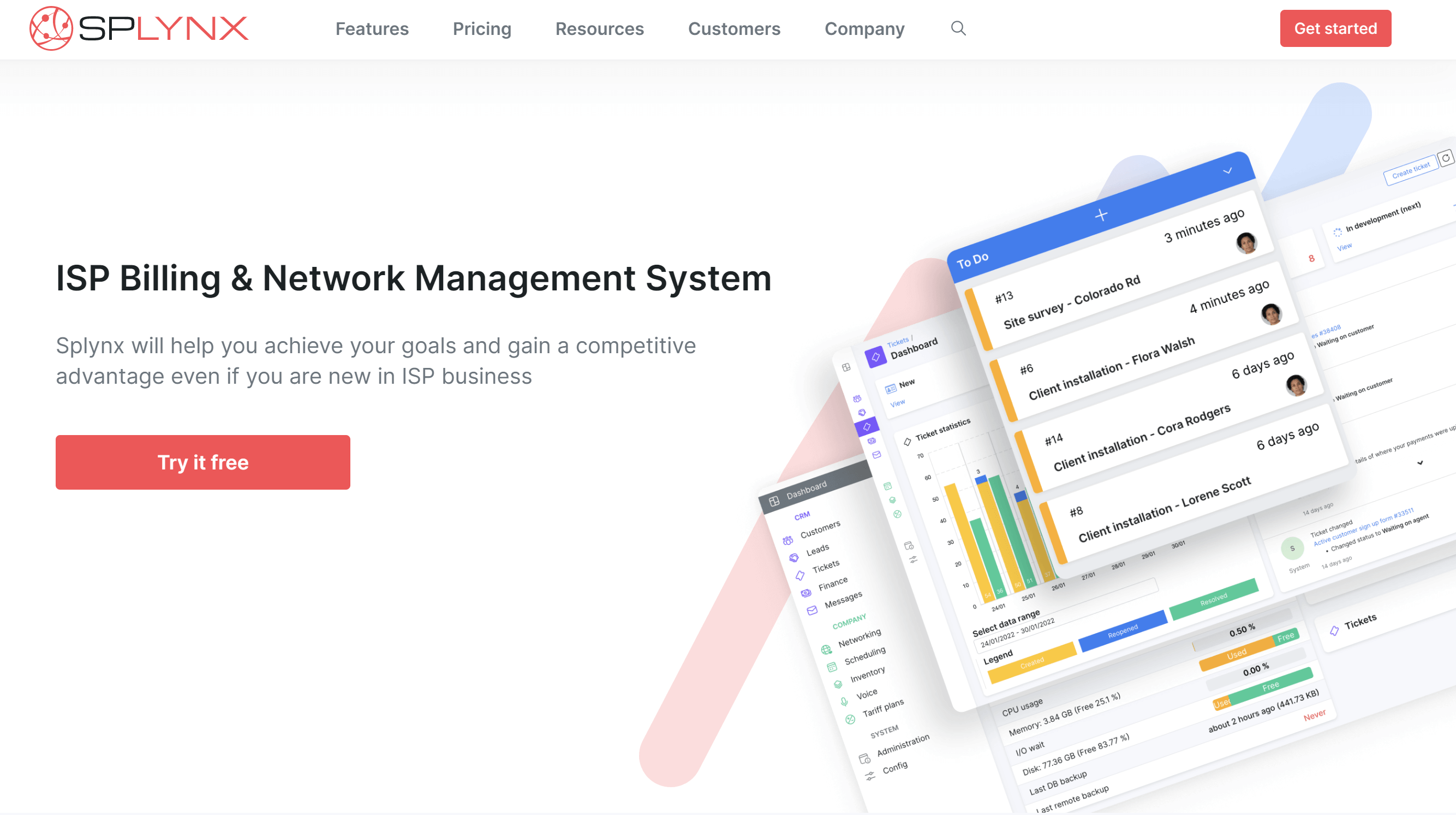
Since we sell one product that offers a multitude of solutions, we decided to give each product function a separate landing page (the “Features” category”) and depict its capabilities in action.
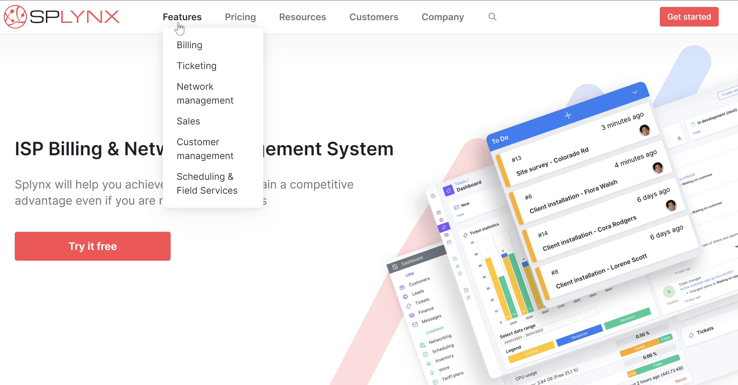
Case studies — we’ve surveyed our customers and asked them to answer to share their experiences. Hope you’ll find it helpful.
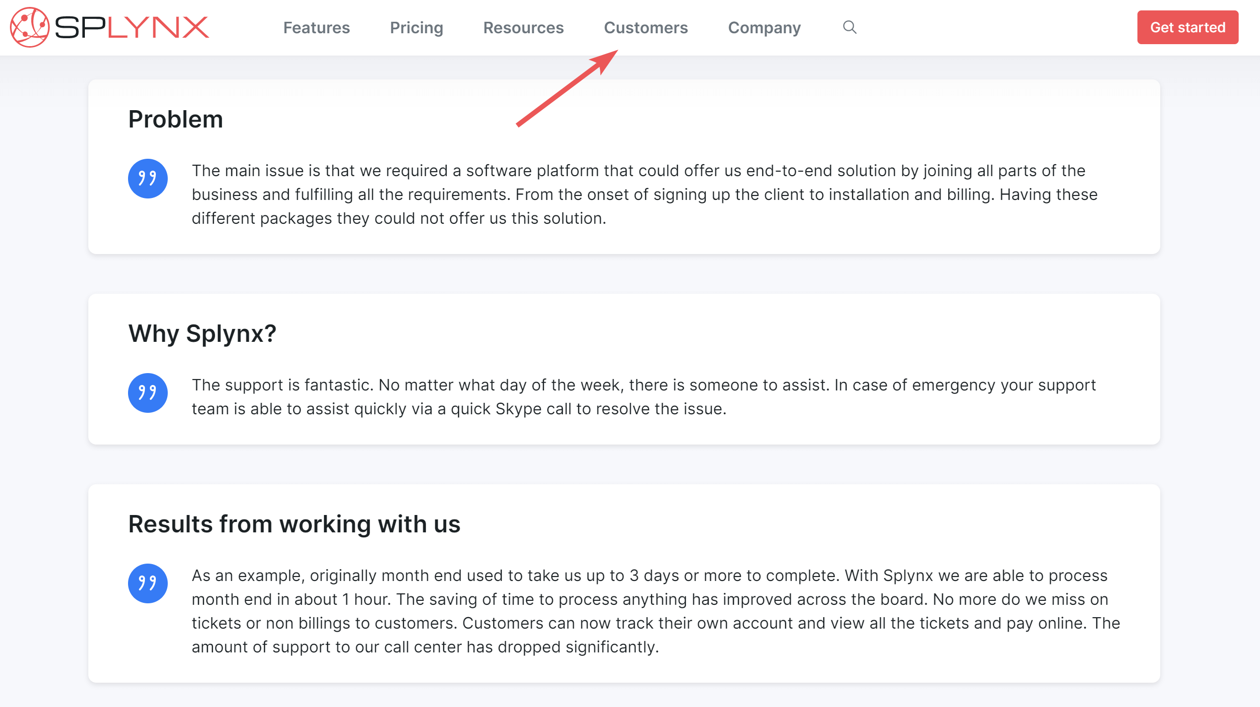
Useful resources — we’ve gathered all the information that should help you expand your knowledge of ISP billing, network management, system administration, Splynx configuration, marketing, and some of the things you can do to master it. And it also works great for self-onboarding.
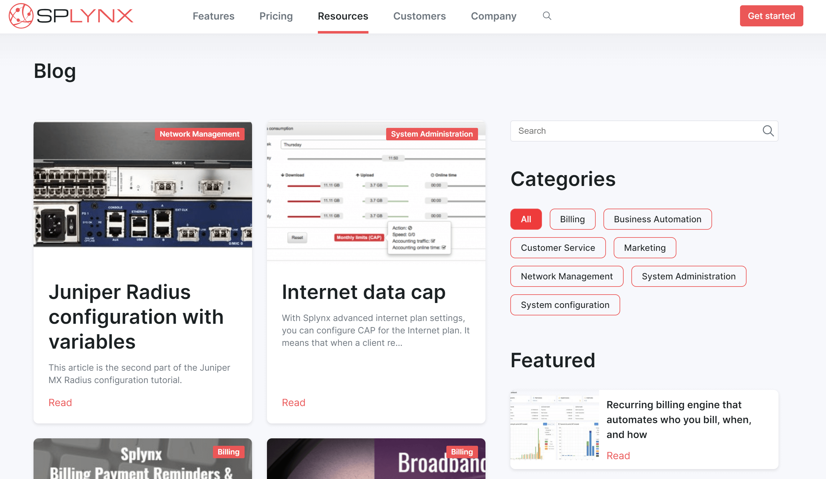
Integrations — now we have a page featuring all services Splynx integrated with. We took into consideration our customers’ complaints who had been struggling to find what integrations were available in Splynx.
Supported payment systems — another element that was missing on the old version of the website and essential for many users seeking an ISP billing solution.
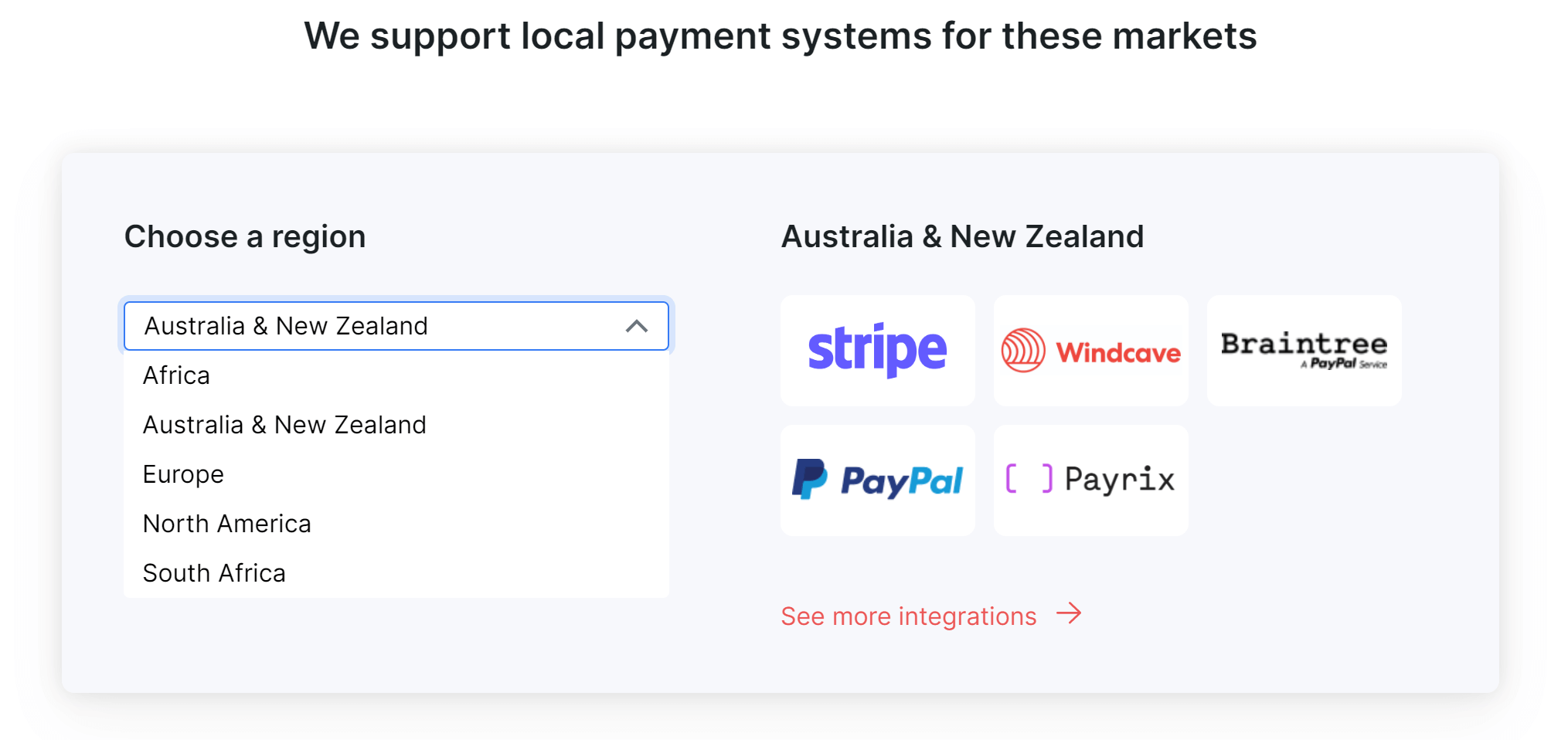
Elaborated CTAs — now, new users understand what button to click to get started using Splynx.
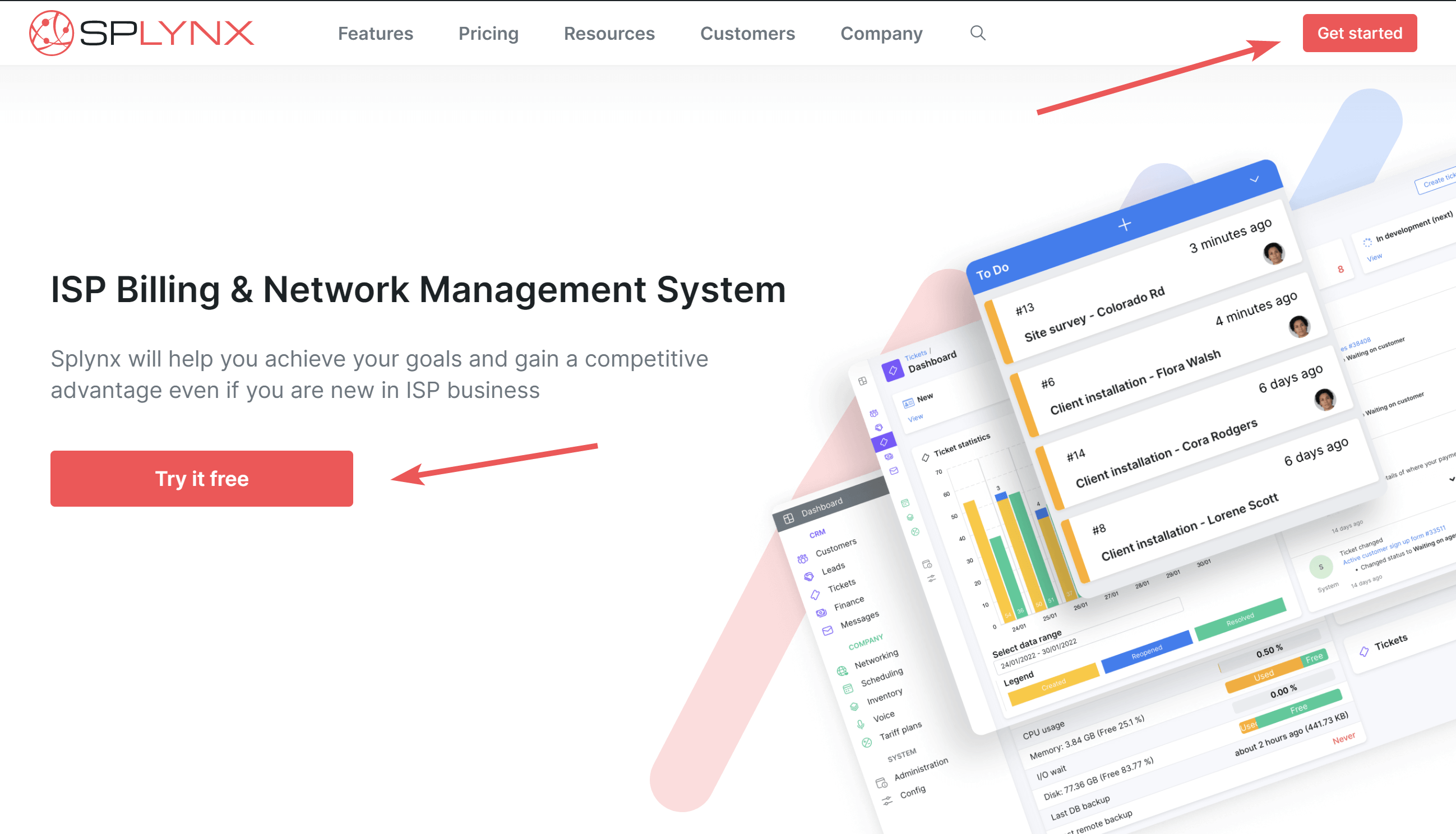
This one deserves a separate mention because you have many tools to deliver information into people’s minds except for words.
To embark on this journey, we’ve attracted the best design talents to get professional help in designing the new website. After a dozen weeks of extensive market research, customer interviews, and product team meetings, we’ve finally come up with what we believe will strike a chord with our users and prospects:
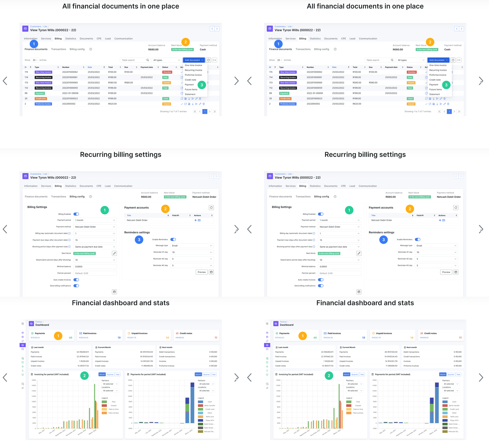
When the new website’s launched, we can say that it was absolutely worth it! We haven’t yet crunched the numbers to see how effective the makeover is, but now the Splynx website can definitely act as a product “business card”. In short:
Find out how Splynx helps ISPs grow
Learn more